|
For this assignment, we had to use the image tag <img src="banner.png" alt="All about me" title = My Previous web pages"> to add images to our previous webpage. Here is the link to my webpage in Neocities.  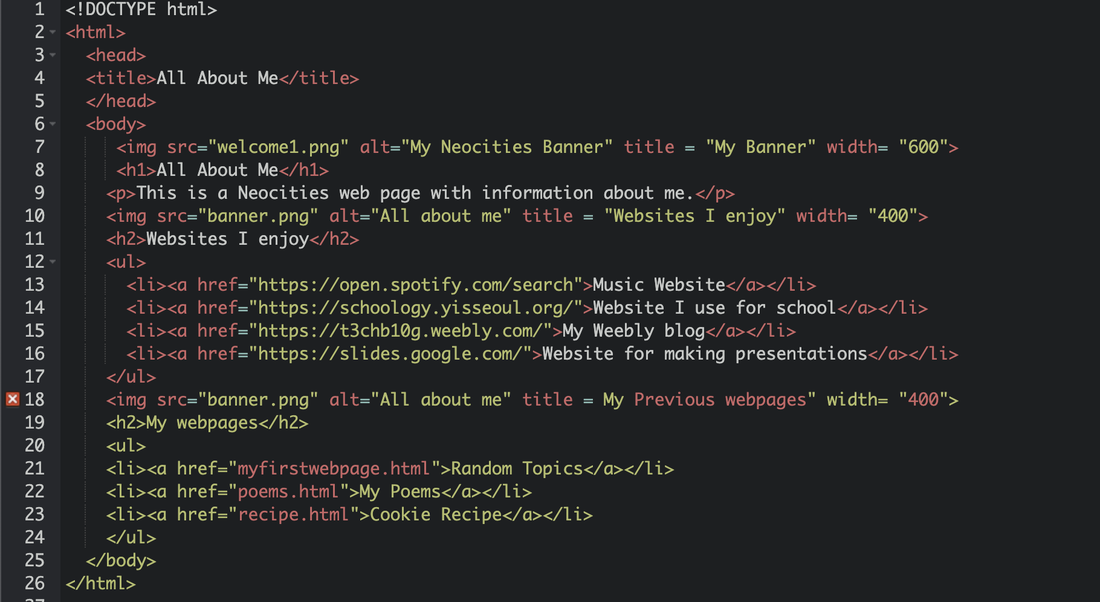
0 Comments
In this lesson, we learned how to use tags such as <li><a href="https://open.spotify.com/search">Music Website</a></li> to generate embedded links into our Neocities webpages. To do this, I made a webpage on Neocities and used these tags to make an all about me page featuring my favorite webpages and more. 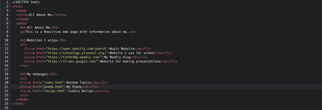 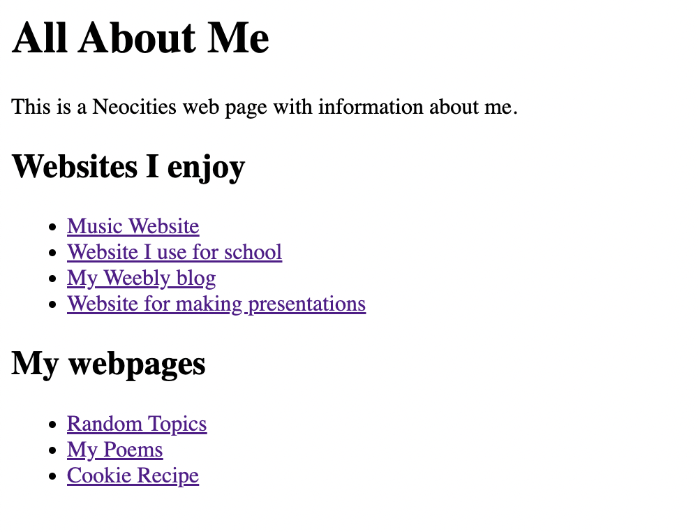 In this lesson, we learned how to make lists and write recipes in Neocities. To make a list I used the tags <li> and </li>. This is the link to my website. 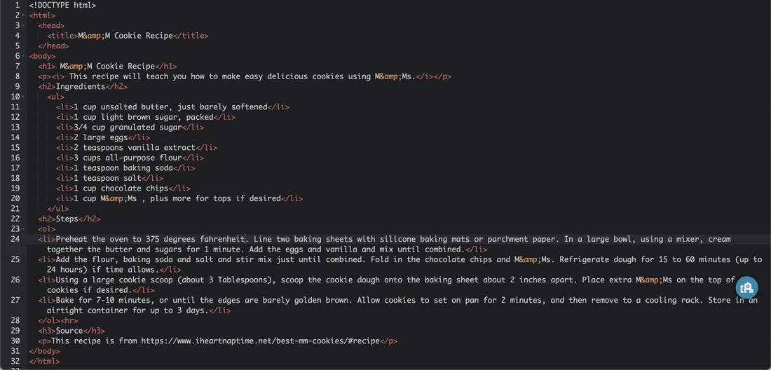 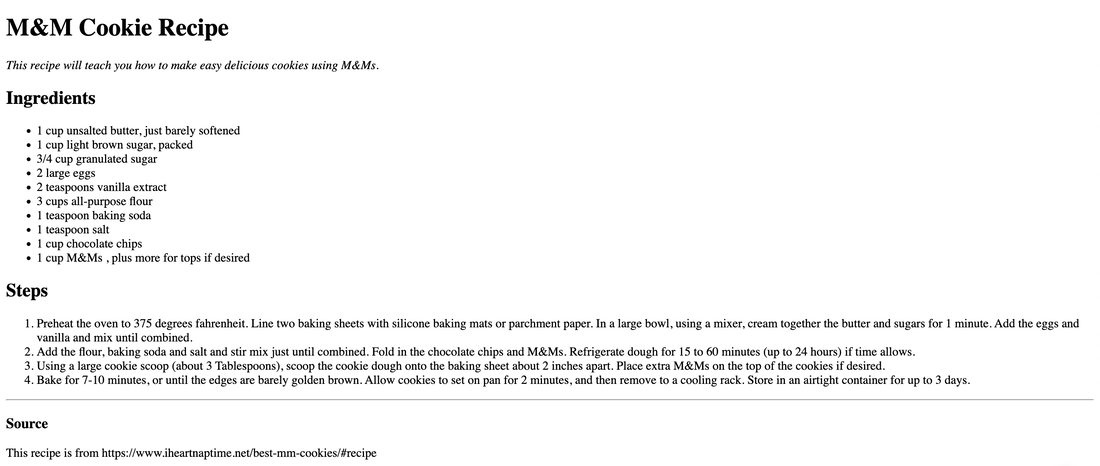 In this lesson, we learned how to write tags for making text bold (<b>) and making text italicized (<i>). We practiced this by writing three different types of poems. Haikus, limericks, and one free verse. Here is a link to my webpage. 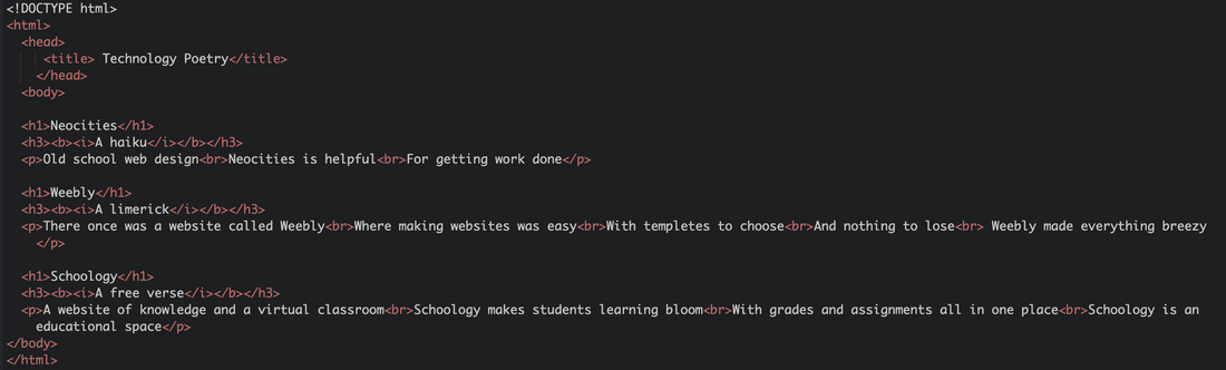 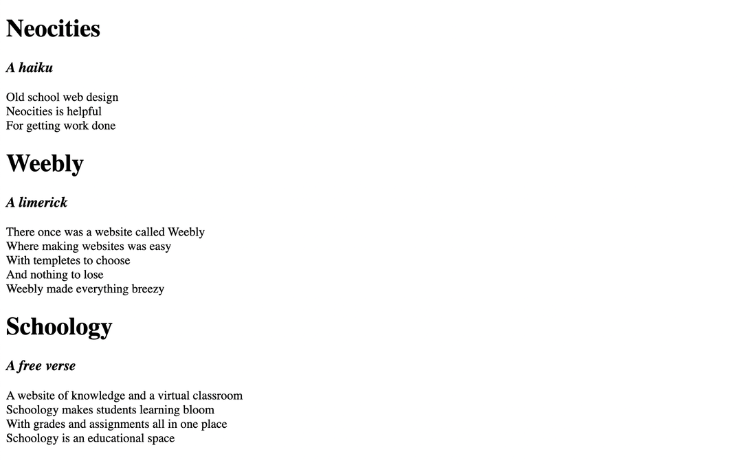 In this technology lesson, we learned how to write HTML code. Along with this, we learned about writing tags such as <p>, </p> and we learned how to adjust the sizes of heading using <h1> <h2> <h3> <h4> <h5> <h6> Here is the link to my first NeoCities webpage.   For this assignment, we had to first brainstorm 15 ideas (described in blog post below this). Next, we had to vectorize 3 designs from out brainstorm paper and create them in Corel Vector. Lastly, we had to make 3 variations of each logo, this resulted in 9 total logos. The challenging thing for me was making the text wrap around the image in a semicircle. However, this minor set-back in the process of designing my logos was soon resolved when I figured out how to do it. My favorite thing about the process was choosing the fonts and the colours as it was fun. I learned how to do many other things in Corel Vector such as wrapping the text around the image. I also think it is cool how we can easily vectorize our drawings and designs. 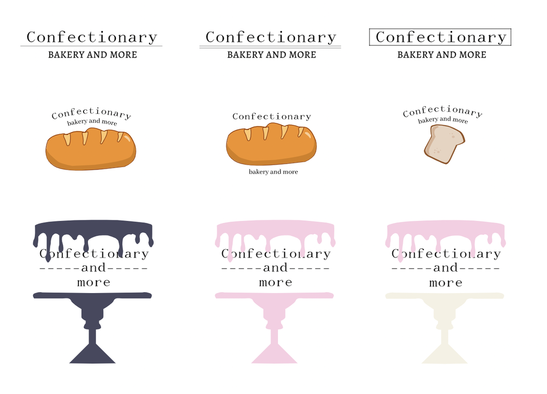 The name of my chosen brand is Confectionary, although for some of the designs, I wrote Confectionary and more or Confectionary; Bakery and more. This brand is intended to be a bakery and cafe. I chose the name Confectionary as I thought it sounded elegant and it has something to do with baked good and deserts. The logo I ended up choosing represents my brands as it is the silhouette of a cake stand and the brand is heavily based around baked goods and desserts including cake. I chose this logo because it matched my brandy very well, because it was a cake stand, and it was also very elegant and matched the adjective I came up with in the beginning. 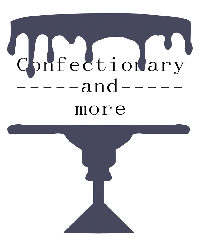 The brand I choose to make a logo for was "Confectionary", a made-up bakery that focuses on the craft of deserts such as cakes, cupcakes, cookies, brownies, and more. I choose these three logos because I liked how they had a simplistic icon such as a piece of bread, baguette, or croissant. However, one of the logos I choose did not have an icon and was only text. I choose this one because I liked its simplicity and I thought it would be easily recognisable as well. These logos represent the bakery in a visually, aesthetically pleasing manner. The process of designing 15 logos was somewhat time consuming but the final result was very satisfactory and I am pleased with the logos that I drew and selected. 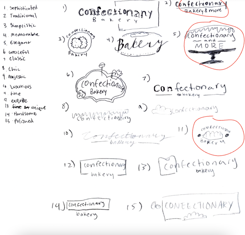 In this lesson, we learned about colour theory. Colour theory is the practical guidance 'artists' use to make designs or works visually appealing using colour. One of the assignments we had to do was about colour names. In that assignment, we had to use a color wheel on Google and pick out 15 different colors that we liked. After this, we inserted the colours into Corel Vector onto different shapes and wrote their HEX codes and their RBG codes next to them. The second assignment we had to do was Color Schemes. For this assignment we had to use the Adobe Color website to create an artwork featuring four different types of colour palettes (analogous, monochromatic, complementary, and triadic). Once I found these color palettes, I copied the colours RBG codes into Corel Vector and pasted them by the colour to create a visually pleasing image. I utilized the tools in Corel Vector to make these assignments easier. Colour Names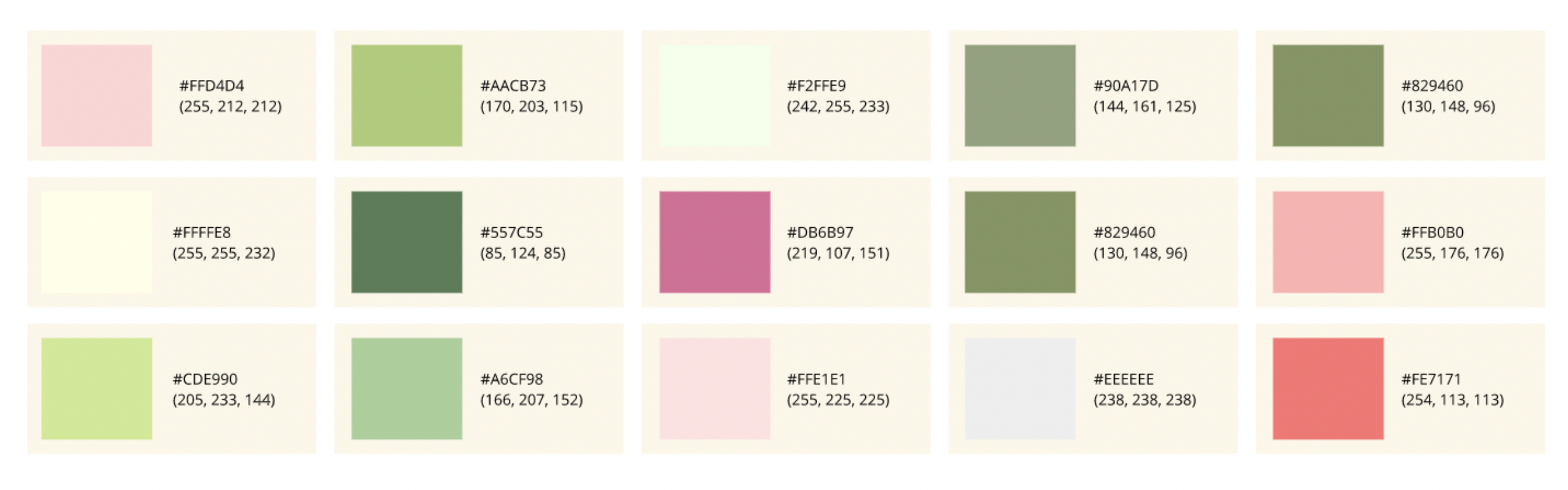 Colour Schemes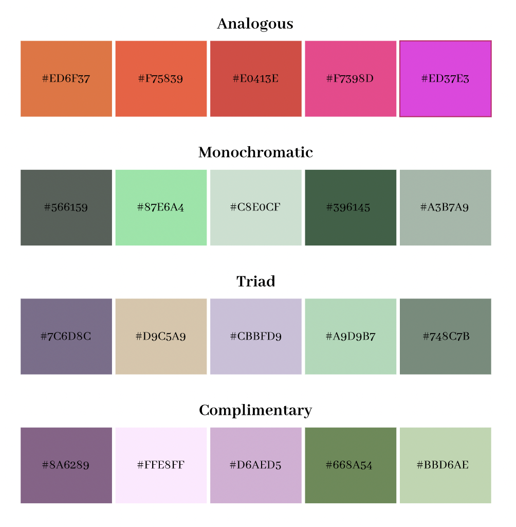 In this unit, we learned about Typography. Typography is the style and format of words or text. Typography is important because it conveys a strong optical hierarchy and captivates peoples attention visually. Typography also establishes recognition and makes the design memorable. The quote, "Each font has a personality and a purpose" means that the fonts that you choose in your designs have an impact and convey different messages. The five different types of fonts include San Serif, Serif, Monospace, Handwritten, and Display. Serif fonts have "feet" while san serif fonts do not. Letters in monospaced fonts take up the same amount of space and they do not work well in large bodies of text. In script/handwritten fonts it is usually cursive, calligraphic, or handwritten. Display fonts are good for getting peoples attention. They are also not good to use in big bodies of text. Typeface ComparisonIn the Typeface Comparison assignment, we had to type out a word or short phrase 5 times using the 5 different font types we learned in class. We then added the name of the font and the type of font above or below the phrase. We also learned more about proper alignment in this activity. 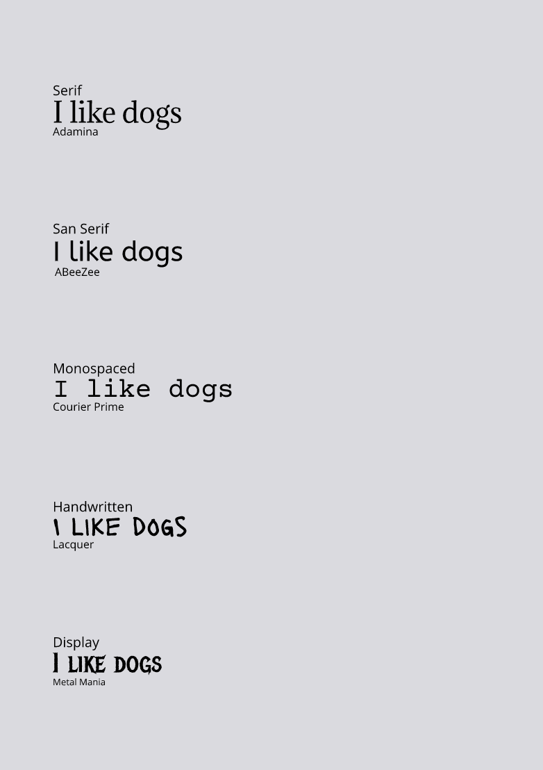 Word PortraitsIn this activity, we had to be creative in using 10 different fonts all of various types. After choosing these fonts, we wrote words or short phrases that matched the fonts and word that didn't. 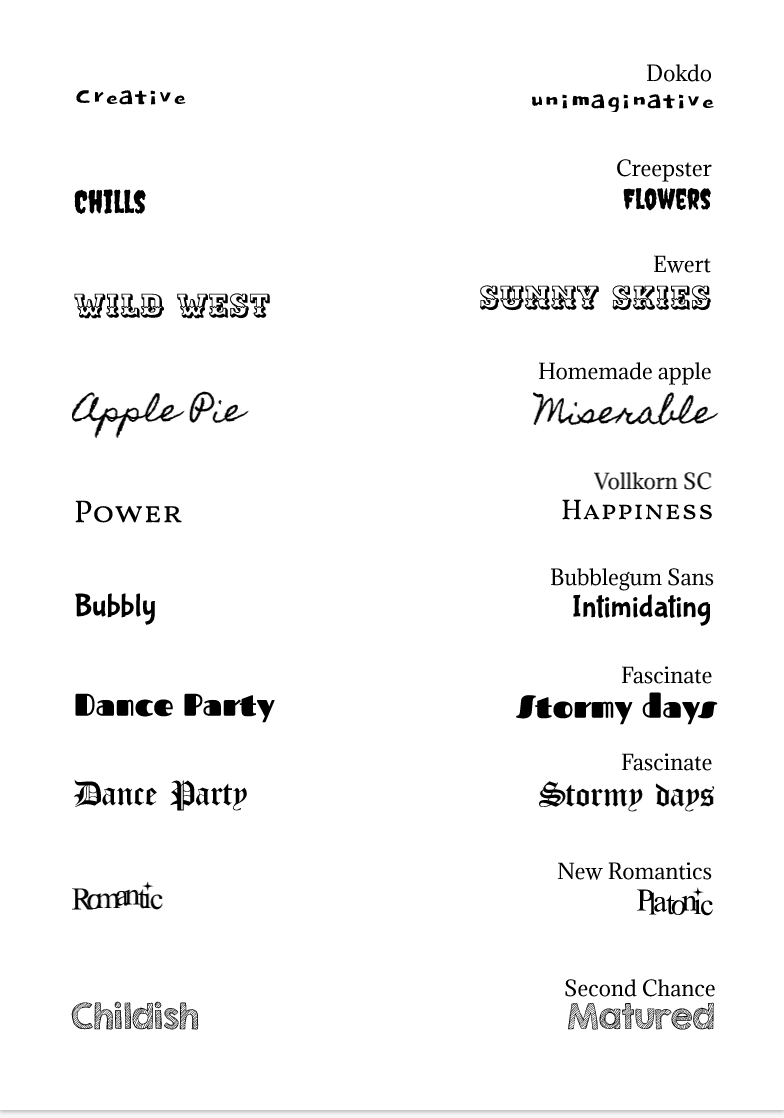 In this lesson, I learned a lot about coding. I also learned how to draw simple scenes with code. Coding is very helpful in real life as it makes devices like computers, phones, and more work. I drew a Christmas tree with ornaments in the midst of a snowy day. I did this by making lots of different white circles over a background and then a giant triangle with more circles on it for the ornaments. I then colored these shapes in accordingly. I used these Khan Academy Tutorials.  background(171, 237, 255);
//snow noStroke(); fill(253, 252, 255); ellipse(100, 100, 10, 10); ellipse(10, 50, 10, 10); ellipse(200, 73, 10, 10); ellipse(300, 200, 10, 10); ellipse(33, 210, 10, 10); ellipse(325, 100, 10, 10); ellipse(288, 49, 10, 10); ellipse(180, 174, 10, 10); ellipse(360, 159, 10, 10); ellipse(82, 35, 10, 10); ellipse(82, 166, 10, 10); //snow fill(255, 255, 255); rect(-1, 336, 407, 99); //tree fill(62, 181, 62); triangle(100, 300, 300, 300, 200, 20); //stem fill(64, 59, 32); rect(174, 291, 53, 63); //ornaments fill(161, 11, 11); ellipse(178, 110, 23, 22); ellipse(202, 172, 23, 22); ellipse(156, 203, 23, 22); ellipse(238, 271, 23, 22); fill(255, 0, 9); ellipse(176, 245, 23, 22); ellipse(240, 219, 23, 22); |
